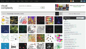
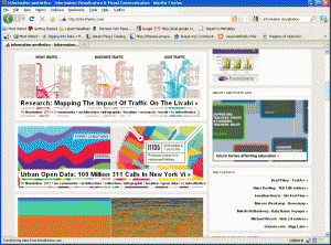
There are plenty of good examples and inspirations of how information can be displayed. Here are the three most popular collections of information visualization samples. Many are beautiful, but not many are meaningful to the viewer. Could KOS structures help to make the displays more meaningful? That’s what we want to explore in this project. What are some of the ideas, styles, formats, or mapping algorithms that we can learn from these examples in order to create meaningful concept displays? Your thought or comments are welcome.
1. Information is Beautiful: http://www.informationisbeautiful.net
2. Visual Complexity: http://www.visualcomplexity.com/
3. Information Aesthetics: http://infosthetics.com


